DEVLog: Battleground Changes
Today we are inviting you to follow us along as we present you with our game development processes and show you how we create our concepts and the assets for our upcoming game. We will walk you through some important updates we have implemented to make our user interface (UI) even better and more intuitive than it was before. This article shows you how we went from version 1 to version 2 and documents our thoughts as we aim for perfection. You can think of this article as the start of a devlog that lets you take a look over the shoulders of our game developers.
The first entry is all about the battlegrounds of the game and some important updates that enhance the game flow and the game mechanics.
The Battlegrounds
Before we dive in, let’s quickly recap to get everyone up to speed. The Deep Sky Network features five syndicates vying for supremacy of the network and control over memory storage space, a very precious and scarce resource that allows Glitches to save and reconstruct their precious lifetime memories. Many of these memories come from a time when they were still human, before they glitched and became permanent residents of the Deep Sky Network, binary ghosts and shadows of their former selves. The battlegrounds are the arenas in which the different syndicates fight over this limited and all important resource.
Our goal was to create five battlegrounds that shared a consistent interface that is easily recognisable by players at a glance, while maintaining their own distinctive look and feel to portray the unique aesthetic of each syndicate.
Evaluating the First Battleground Versions
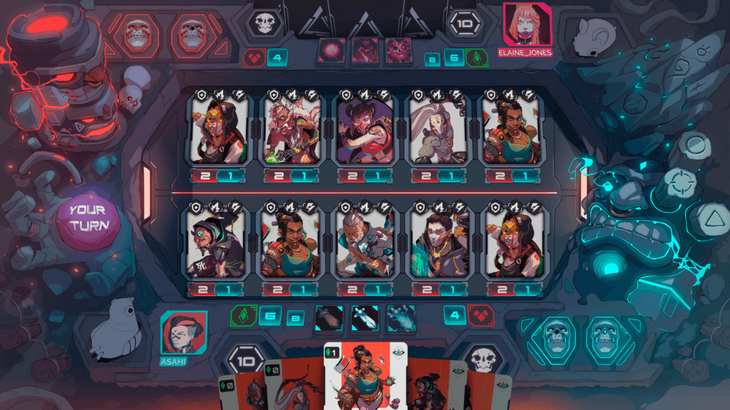
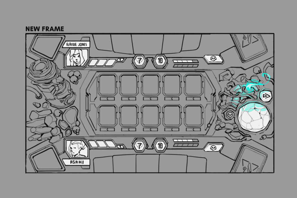
The battlegrounds have come a long way since their first inception on the drafting boards of our studio. Here is one of the first sketches we shared with you on Discord.

You will recognise the battleground because it was the one of the Curator’s Maxima that was featured in our first gameplay demo trailer. We still fondly remember all the positive feedback we got from our community and partners when we released it!

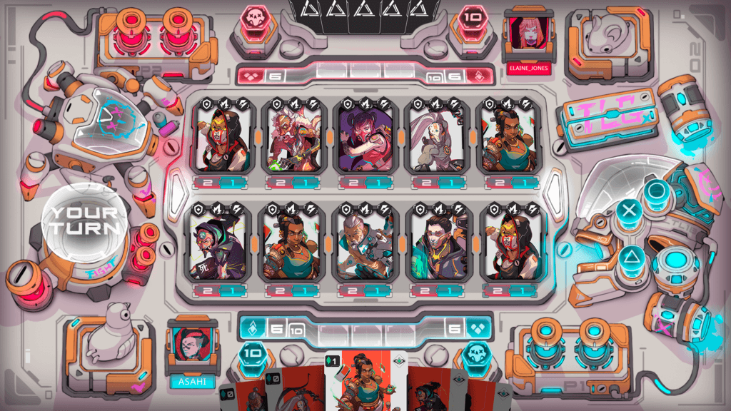
The Adamant Hands battleground was unveiled shortly after and was received equally well by the community.

We agree that our game designers and developers did an excellent job and accomplished and fulfilled all the goals we set. We thoroughly review everything because we are always aiming for perfection. After gathering feedback from our design team and internal play testing, we implemented some important changes that make the gameplay even better!
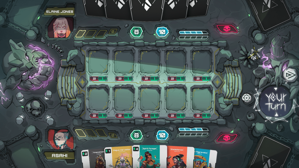
Today we want to unveil the next version, version 2, of the battlegrounds and update you on some of the great layout changes that improve the UI and will lead to an even better playing experience than before. We are excited about starting the devlogs and showing you our thought processes in the game’s development in detail so you can see all the love, care and thoughtfulness our team puts into creating the best playing experience possible! Here at The Lost Glitches and Mimunga Gaming we are extremely passionate about quality and ensuring a premium quality standard in everything we deliver is one of our core values.
Updates
What follows is an overview summary of the updates and enhancements we implemented:
→ Health has been placed in a visually more important place and can be seen easier than before
→ Energy has been placed in a visually more important place and can be seen easier than before
→ Card overlap has been reduced resulting in the illustrations being more visible
→ Which cards are playable is easier to see than before
→ The skills have been adjusted to blend in more harmoniously
→ Max energy received the same visual importance as current energy
→ Cards do not cover the graveyard
→ Turn indication is more clear now
→ Action button has been relocated to the right to enhance game flow
→ Visual elements have been optimised to enhance the player’s focus on the battle itself
We think you will agree that all of the implemented updates above will greatly enhance gameflow and let players understand the UI even more intuitively than before. We love making great things even better! We are dedicated to making our game a fun and high quality experience for everyone, from seasoned TCG players to beginners!
Let us further show you how we examine our work with an example about the colour coding for the Adamant Hands battleground. We love the aesthetics and unique syndicate feel our game designers put into the creation of it. However, we did identify some minor points of improvement when it comes to the colour coding of the battleground.
Since the main colour of the arena is white, the hand cards do not stand out as much as they do on a darker battleground, like the one of the Curators Maxima syndicate, where the cards, which in their Classic edition have a white background, do stand out much more. The cards do have a cyan outline but everything in the Adamant Hands’ battleground is already highly saturated with cyan and pink highlights. We want to ensure that the focus is on the battle itself and we want players to be able to easily and efficiently take in all the important information they need. So with that in mind we made some enhancing tweaks so that the board itself and all the important stats receive more visual importance!
The following overview shows you a legend in terms of visual importance of all the items visible on the battleground that we created for the enhanced, updated versions.

You can see from the items in the list that the most important elements (blue) , the ones that directly deal with the most important battle information, received the highest visual relevance, meaning that the players should always be able to see and take them in very quickly. Other items of high relevance (green) to the battle should also never be hidden during any of the phases of the match. Elements of medium relevance (yellow) do not have to be prominently displayed but should be visible at a maximum of one click or hover. Items of low relevance (red) deal with information that can and should be hidden away. Least important (pink) and not really relevant for gameplay are the objects and elements that add visual spice or eye candy. They add to the battleground scene as a whole but are in and of themselves not that important.
The New Battlegrounds
After implementing all the visual enhancements and updates, we believe that the new and improved battleground designs make it even easier to see all of the important stats at a moment’s glance. The most dramatic overall design change is that the action button is now on the right side, an important update that we believe will make gameplay feel more intuitive and natural since the vast majority of gamers steer their mouse with their right hand.
It is with great pleasure that we unveil and present to you the new and improved battleground concept art designs of each of the syndicates.
Adamant Hands

Curators Maxima

Sentinels of Eternity

Song of the Chain

Outro
We are certain that the latest updates will enhance the game’s flow and visual accessibility and create an even better experience for the players than before! We look forward to hearing what you think! We hope that this deep dive and look into the internal processes of our game development team has been interesting and insightful to you! We look forward to publishing many more devlog entries in the future!
